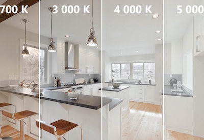
50 Shades of Light

March 16 2016
Blue, white, red, green, yellow, or gray? Choosing the right colour temperature for lighting installations can be every bit as complicated as choosing the perfect colour for the walls. Fortunately, Standard has the answers to your questions: What do the technical terms mean? What effect does each colour have on people? What kind of lighting is best for each room or space?
Light colour and its effects
The terms warm and cool are used to describe sources of white light.
First, incandescent (or traditional) bulbs give off a warm white hue to create a relaxing, inviting atmosphere.
Cool white, on the other hand, is a bluish-white hue, similar to moonlight reflecting off snow. This type of lighting accentuates contrast while refreshing and invigorating the atmosphere of the room.
The third type of lighting creates the feeling of being near a window. This is called day lighting, and gives a room a bright, natural look.
A colour for every room and space
Each room and space has its function, its own special atmosphere. The colour temperature of the lighting has to match these characteristics.
Warm white is a warm, soft hue, perfect for intimate locations such as living rooms, bedrooms, or even a bar or a restaurant in the evening. In other words, for convivial settings that lend themselves to relaxation, reading a good book, or just enjoying good company.
Kitchens, warehouses, shops and public spaces require clear, precise lighting to enhance the quality of work and prevent accidents. Cool white is best for these locations.
Day lighting is designed to give the impression of sunlight on the inside and is ideal for offices, reception areas, and restaurants specializing in breakfast or lunch.
Fluorescent, compact fluorescent, and LED lamps offer great flexibility in terms of lighting and colour. A wide range of colour temperatures are now available that are adaptable to every kind of application. See below for how different colour temperatures play out in four different applications.
Colour temperature: 4 applications
The colour temperature of a light source in a specific room or space may have a dramatic effect on the people using that particular lighting whether it is to perform a task, relax or learn. For this reason, choosing the right colour temperature for a given application is of great importance.
Colour temperatures are measured in Kelvin and, vary from warm for a cozy atmosphere to cool for a clean and modern look. Choosing a colour temperature is very subjective and everyone has his own preference when creating an ambiance. The applications below can help identify and select colour temperatures best suited to the setting.
Residential

- Warm White (2 700 K): Welcoming, smooth and relaxed lighting. Emphasizes reds and yellows to create a comfortable living space!
- White (3 000 K): Dynamic and even lighting. Create a neutral light for a friendly and relaxed environment!
- Cool White (4 000 K): Radiant, clean and stimulating lighting. Design a space perfect for reading with a modern look!
Restaurant

- Ambiance Amber: Comfortable and stylish lighting. Create an atmosphere that has character and charm!
- Warm White (2 700 K): Welcoming and smooth lighting. Highlights reds and yellows to create an inviting space!
- White (3 000 K): Dynamic and even lighting. Create a neutral light for a friendly and relaxed environment!
- Cool White (4 000 K): Radiant, clean and stimulating lighting. Use this crisp light to create a modern look!
Commercial office
- Warm White (2 700-3 000 K): Welcoming and smooth lighting. Highlights reds and yellows to create an inviting space!
- White (3 500 K): Dynamic and even lighting. Create a neutral light for a balanced environment!
- Cool White (4 100 K): Radiant, clean and stimulating lighting. Helps increase contrast, perfect for task lighting and work environments!
- Daylight (5 000 K): Pleasant and luminous lighting. It imitates sunlight to create a stimulating and lively environment!
Warehouse
- Warm White (3 000 K): Smooth lighting. Highlights reds and yellows; it is ideal for smaller warehouses!
- White (3 500 K): Dynamic and even lighting. Create a neutral light for a balanced environment!
- Cool White (4 100 K): Radiant, clean and stimulating lighting. It helps increase contrast, perfect for large warehouses!
- Daylight (5 000 K): Pleasant and luminous lighting. It imitates sunlight to create a stimulating and clean environment!
See photo demonstrations of the four colour samples for a commercial office and a warehouse: http://www.standardpro.com/tools/colour-temperature/.


![Guide to the Canadian Electrical Code, Part 1[i], 26th Edition – A Road Map: Section 24 — Health Care Areas](https://electricalindustry.ca/wp-content/uploads/2022/11/Guide-CE-Code-2.png)


